Introduction
Established in 2003. ComfortDelgro Driving Centre (CDC) offers a comprehensive range of driving licenses including those for cars, motorcycles, buses, and taxis, as well as information and services for both learners and licensed drivers in Singapore.
My team conducted a case study of the existing application’s issues and overhauled the app using Figma according to users’ needs & wants. This project was completed in a period of six weeks.
My Role
I was the Lead UI/UX Designer of the team and my main role was to design the entire high-fidelity prototype in Figma. Additionally, I assisted in user research and usability testing as well.
Problem Statement
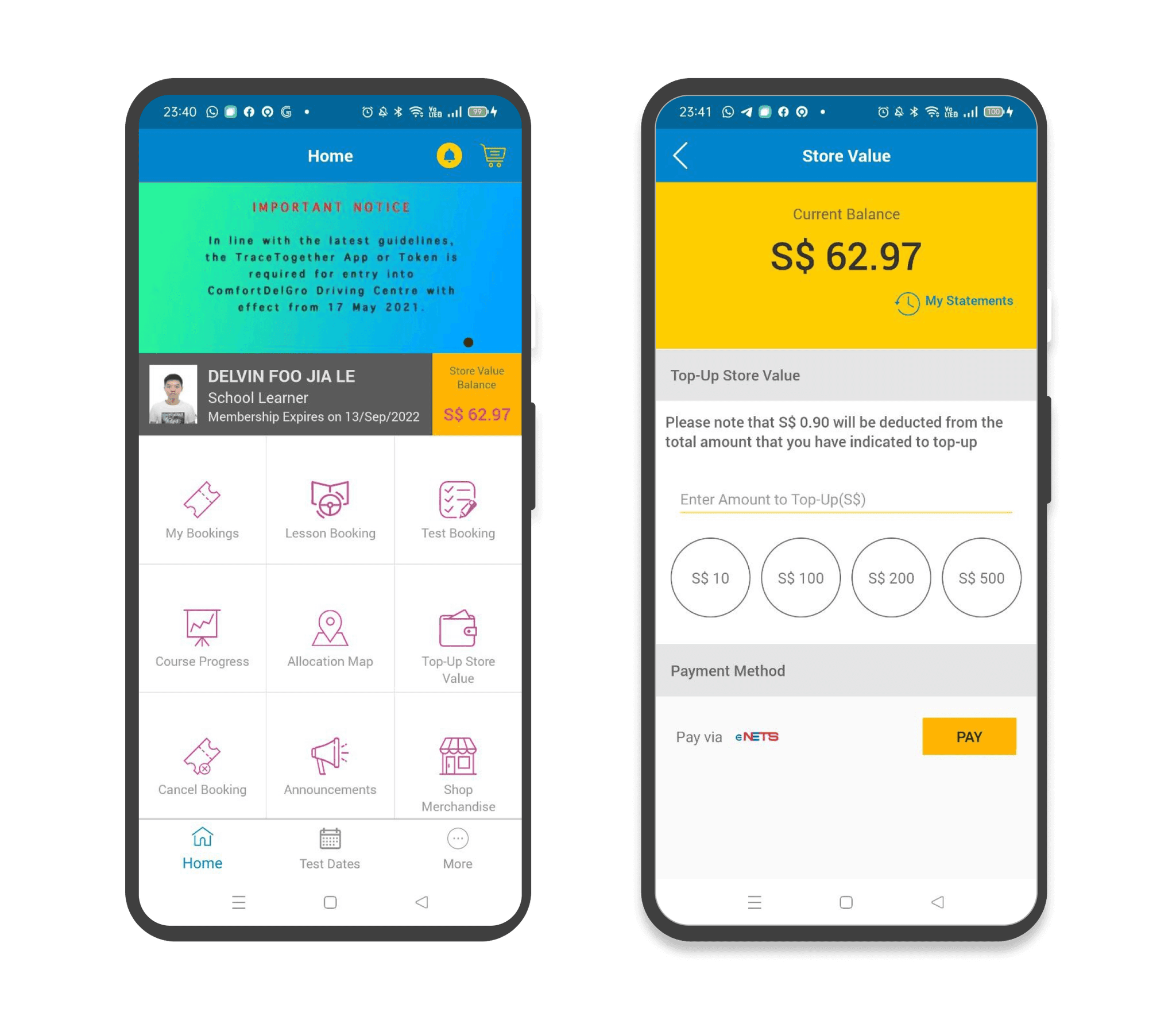
With an increasing number of students seeking driving licenses, driving schools such as CDC have come up with ways to ease and simplify the process of booking lessons and tests through mobile apps. Our team discovered, however, that the app was plagued with problems causing frustration for users.
These were the main issues we encountered:
Complex User Interface
The current design of the app involves multiple steps to access different features, which can be overwhelming for users.Confusing and Cluttered Pages
This led to confusion and frustration for users. E.g. The Home screen had redundant information that could not be removed.Poor Visual Hierarchy
Poor colour, font choice, and a dated design created an overall messy user interface that is also visually unappealing.
Goal
The main goals of the project were to:
Resolve pain points for users
Simplify and redesign the app experience
Ease the process of booking lessons and tests
Design Process
Heuristic Evaluation
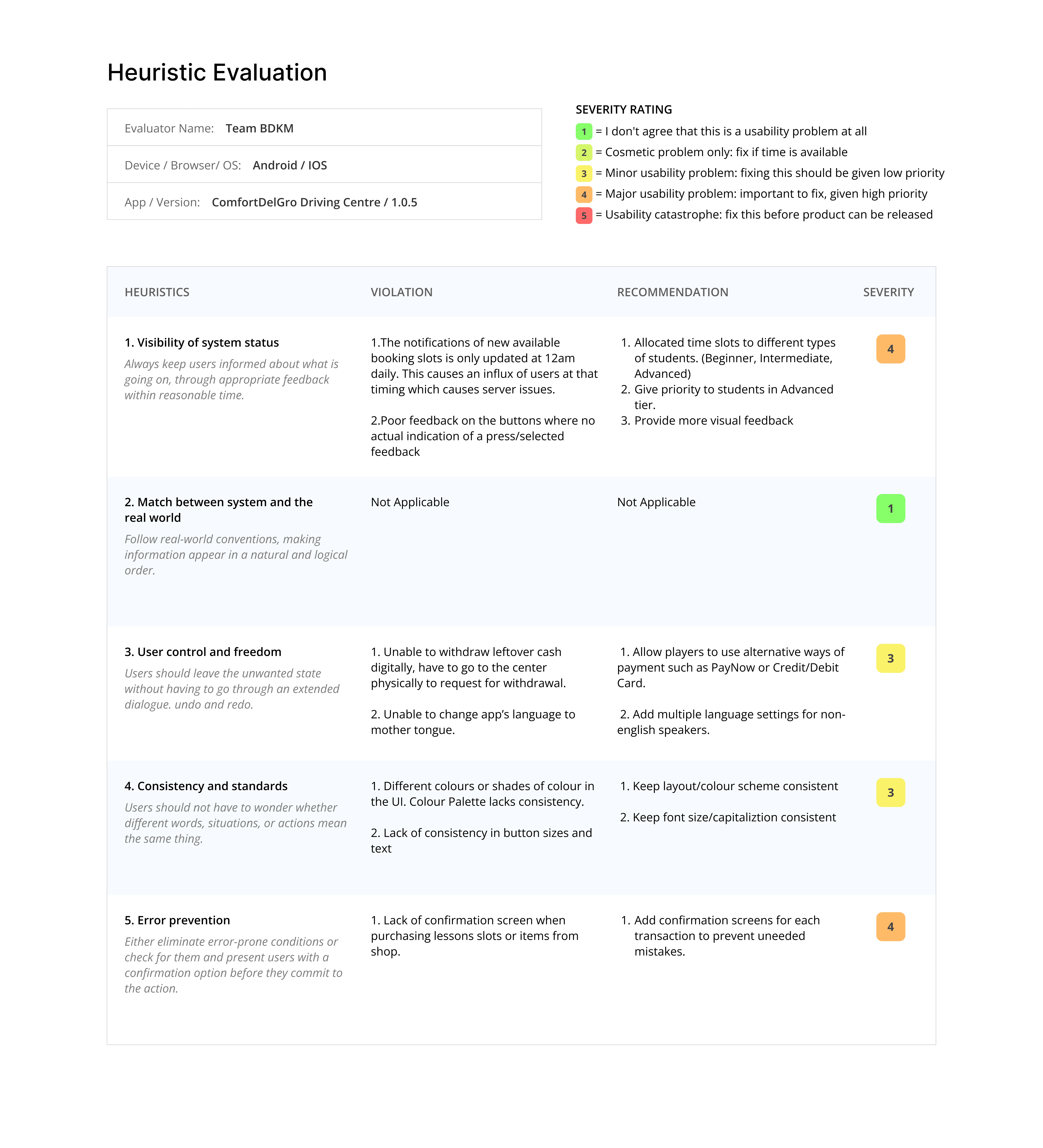
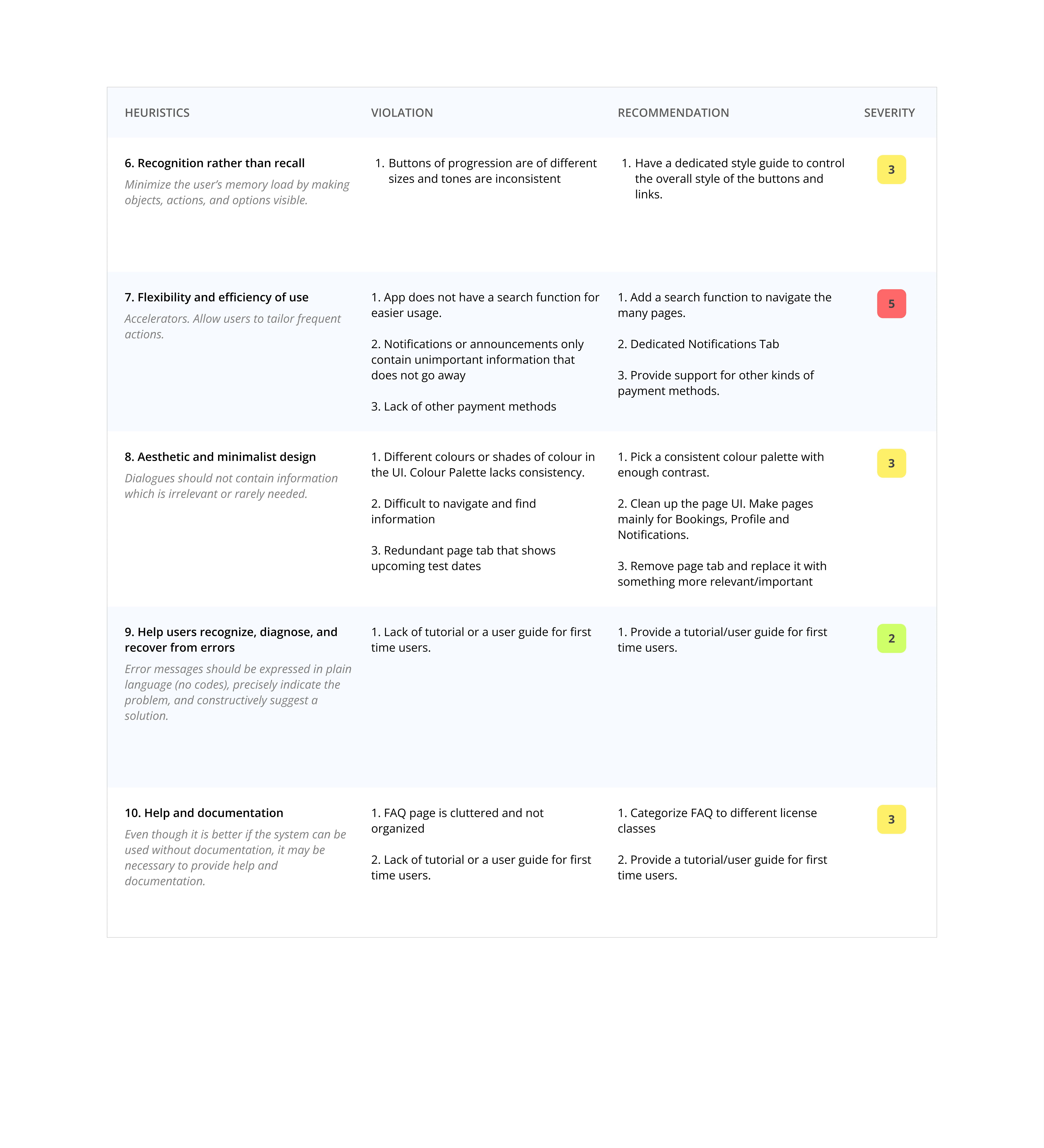
Using Jakob Nielsens' ten general principles of interaction design, we conducted a Heuristic Evaluation to assess the app's usability and identify any existing issues. This helped us to gain a comprehensive understanding of the severity of different heuristics present in the current state of the app.
User Personas
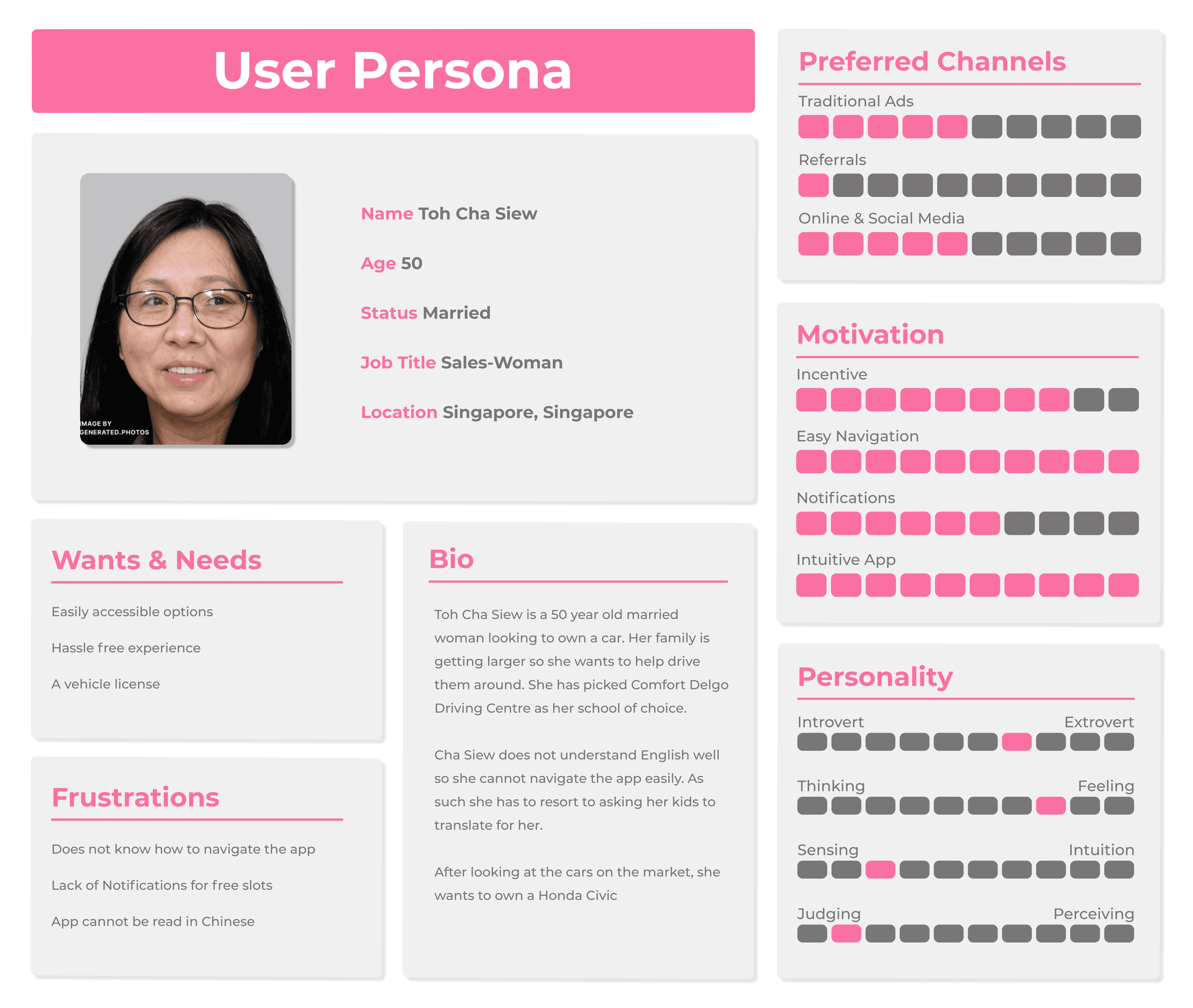
To gain a deeper understanding of our target audience, we created three distinct User Personas with diverse backgrounds. This approach provided us with valuable insights for designing an app that addresses the needs of a broad range of users.
The Outcast Archetype
The first persona is a 50-year-old lady that is not fluent in English. She finds it frustrating to navigate the app due to the language barrier, making her feel alienated from the app and its services as she requires extra support.
The Maverick Archetype
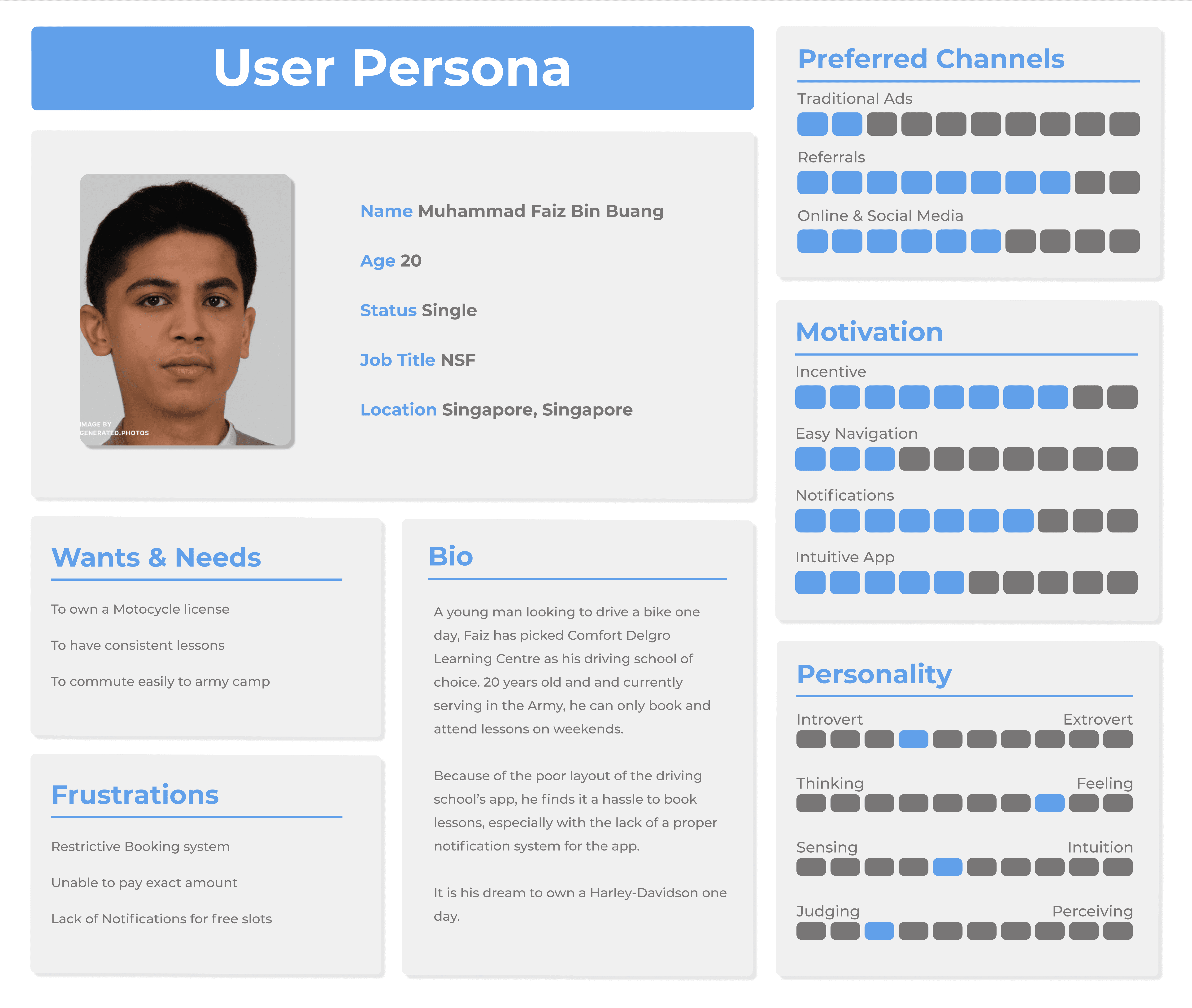
The second persona is a 20-year-old man who is currently serving in the army. He finds that the app has a restrictive booking system and has difficulties paying the exact amount for his lessons as the app's top up system only accepts fixed amounts. He feels that the app should have more flexibility and so much more can be done to improve the app experience.
The Innovator Archetype
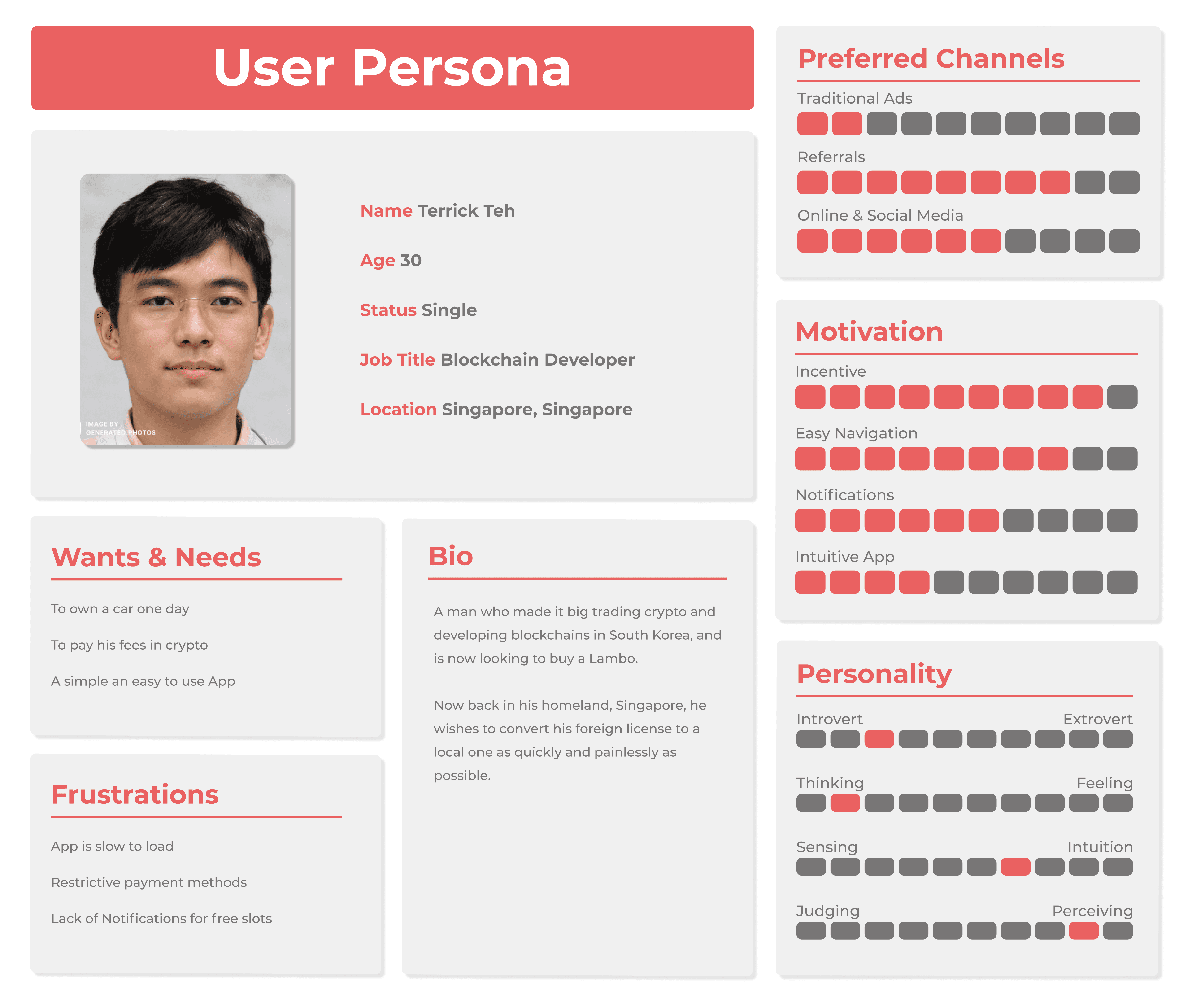
The third persona is a 30-year-old man who works as a developer and is a perfectionist. He wants to convert his foreign driver's license to a local one and is frustrated with the app's slow performance and restrictive payment methods.
Empathy Maps
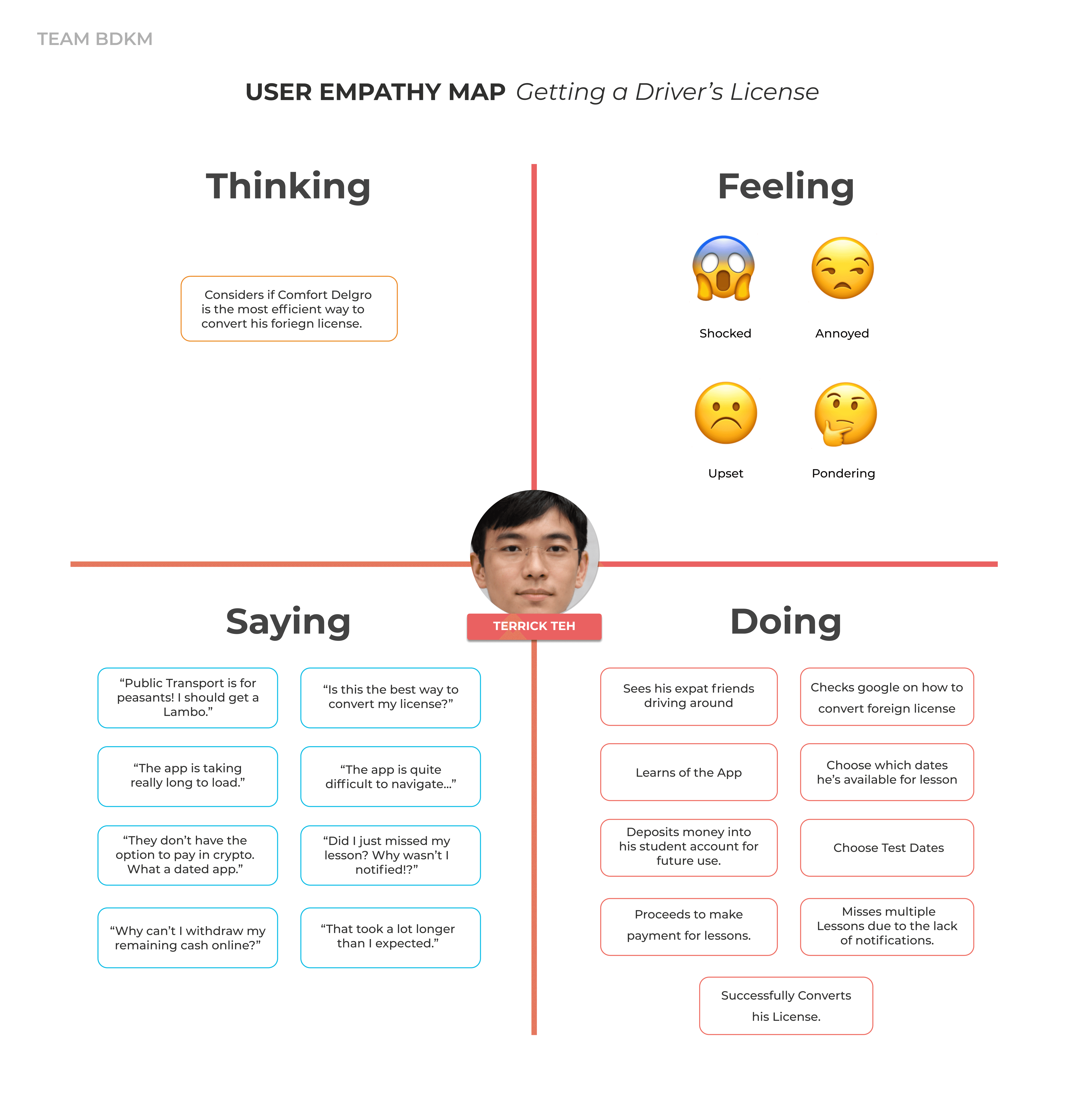
An empathy map we made for one of our User Personas to get a better understanding of the emotions and thoughts the user may experience while using the app.
In this empathy map, we find that the third persona, Terrick, experiences difficulties in converting his foreign driving license using the app. He expresses feelings of shock, annoyance, and frustration with the limitations of the app. Terrick feels the app is outdated, as it does not support his preferred payment method of cryptocurrencies. Additionally, he misses important lessons due to the absence of adequate notifications in the app, further exacerbating his frustration.
User Journey Maps
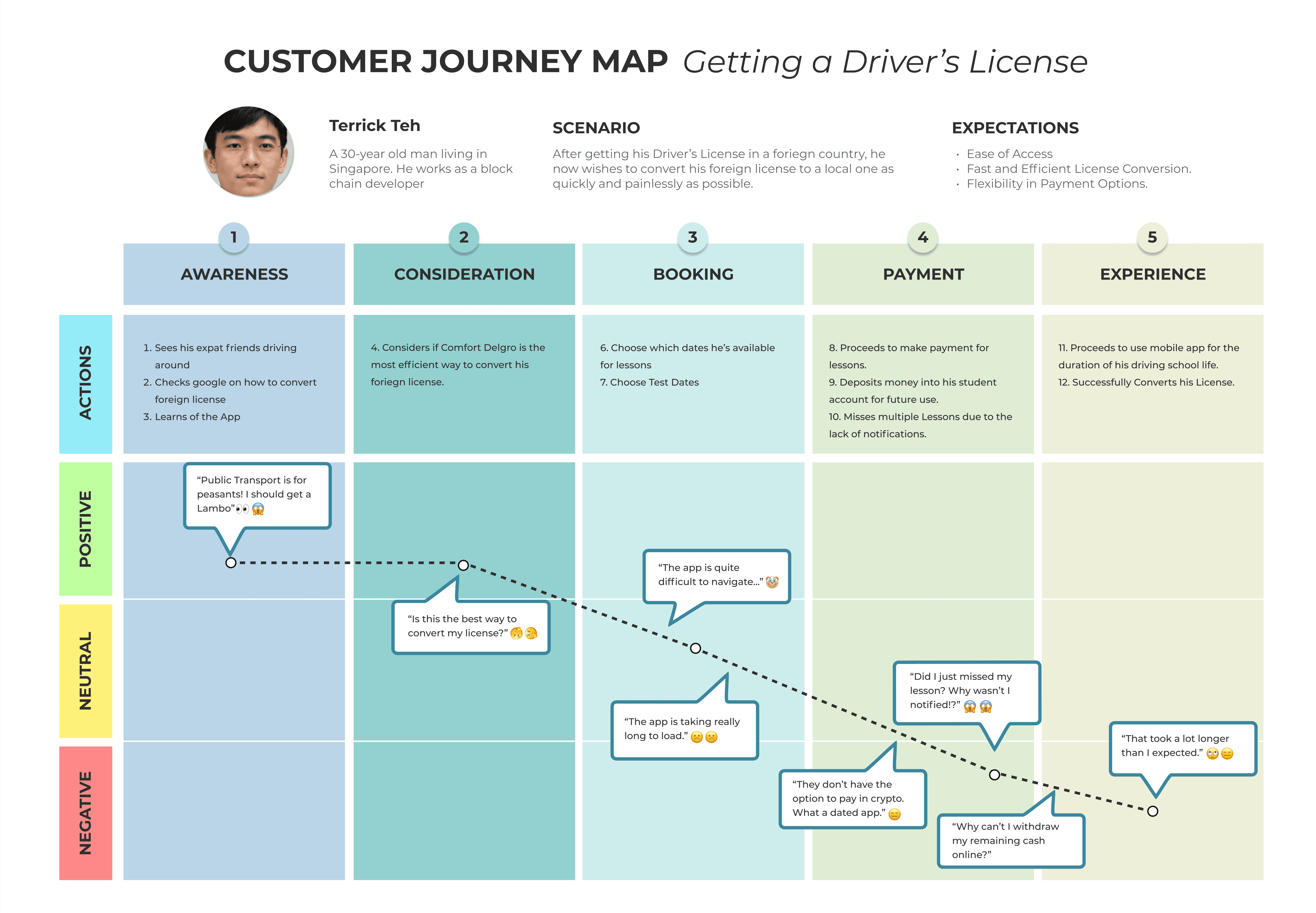
The User Journey Map gave provided us with a comprehensive understanding of the users' emotions and experiences at each stage of using the app.
The map highlights Terrick's frustration with the app. Despite initially starting on a positive note, he experienced frustration and dissatisfaction due to the slow process of converting his license, outdated payment options, and a lack of notifications. Terrick's negative experience with the app suggests a need for improvements in payment options and timely notifications.
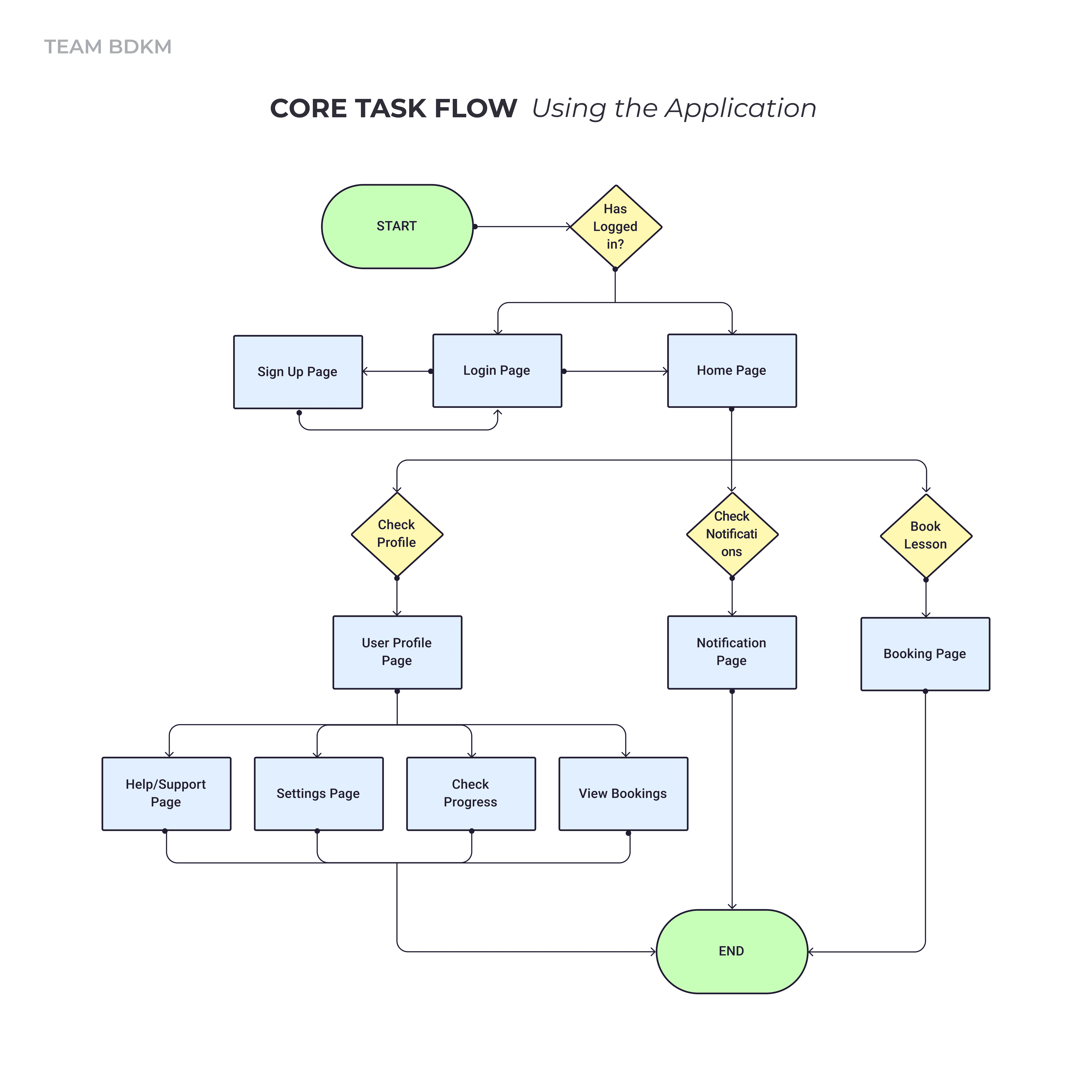
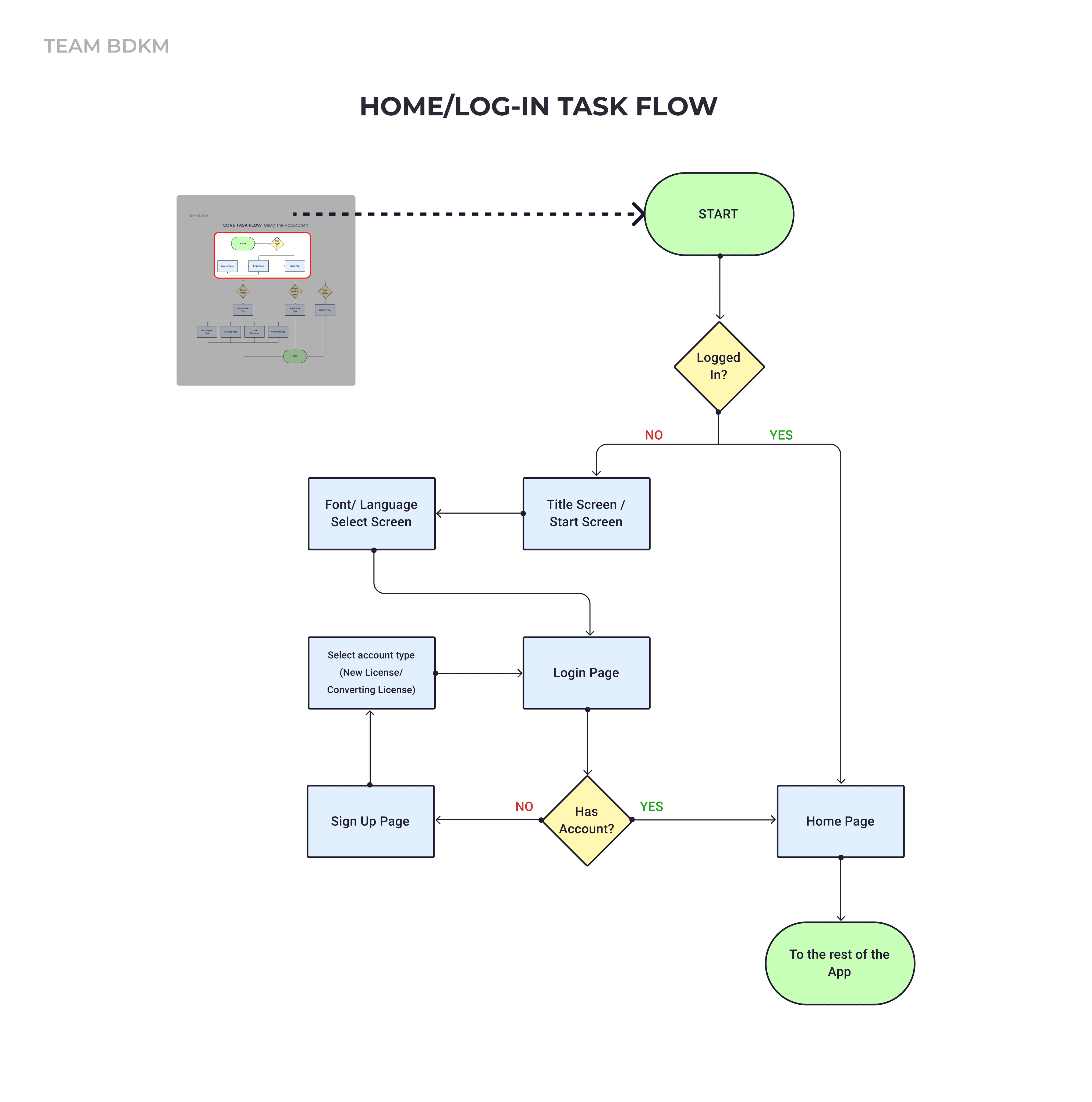
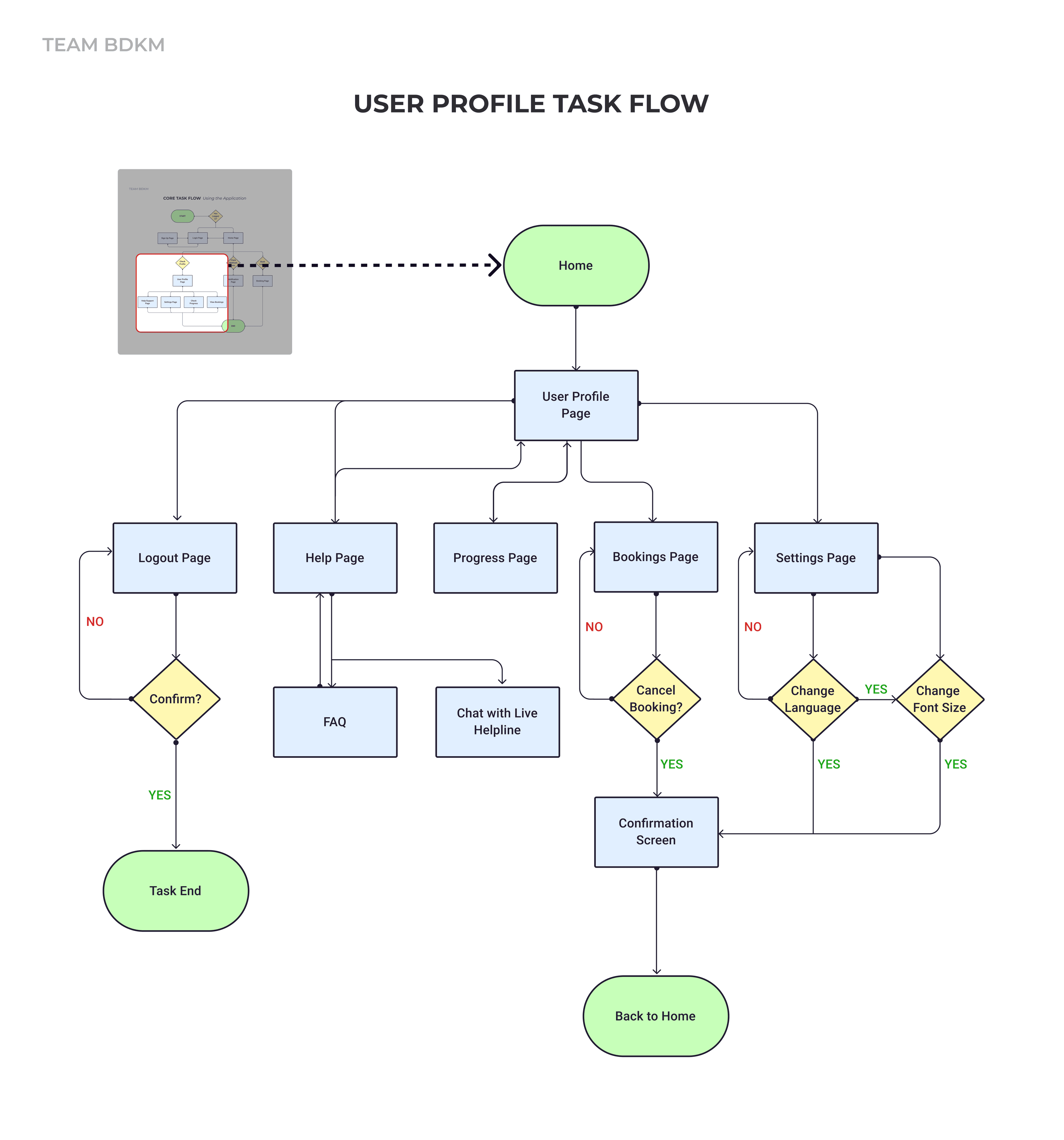
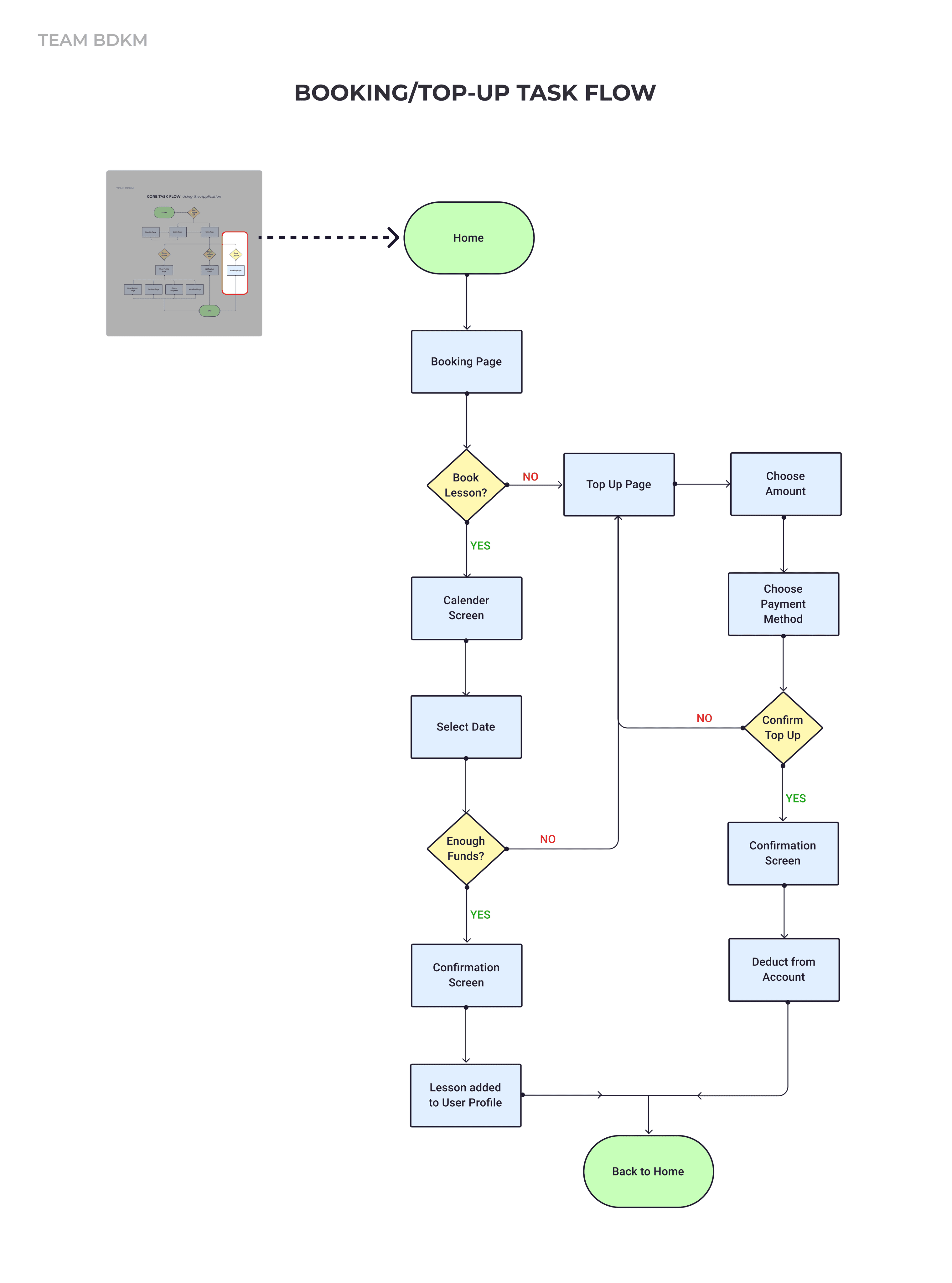
Task Flows
To gain an understanding of the app's navigation and functionality, we mapped out the core task flow of the app.
Low-Fidelity Prototype
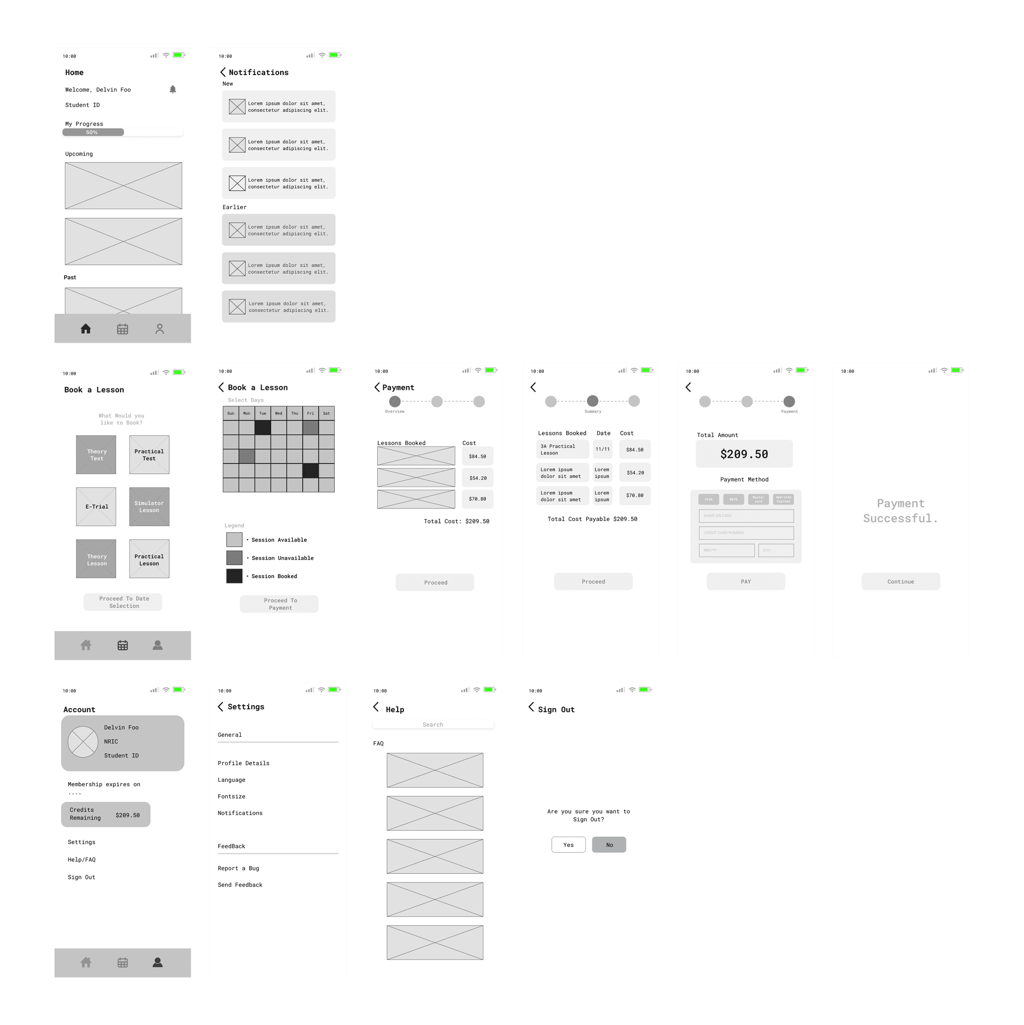
This was the low-fidelity prototype that was done in Figma using the findings that we had gathered thus far.
Usability Testing
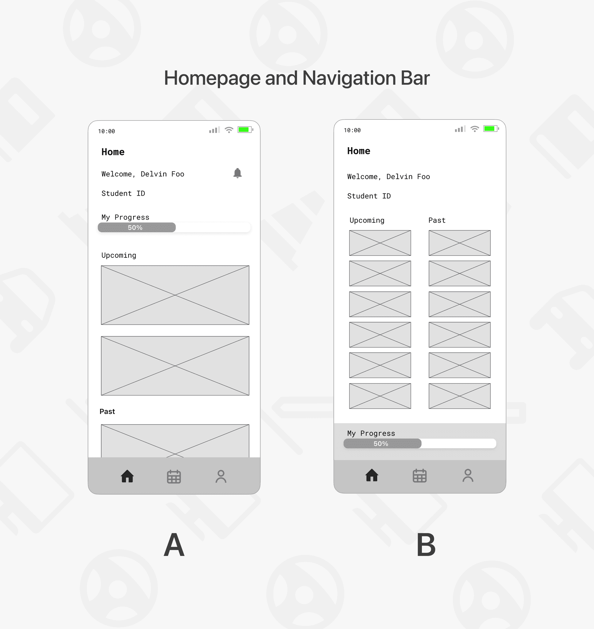
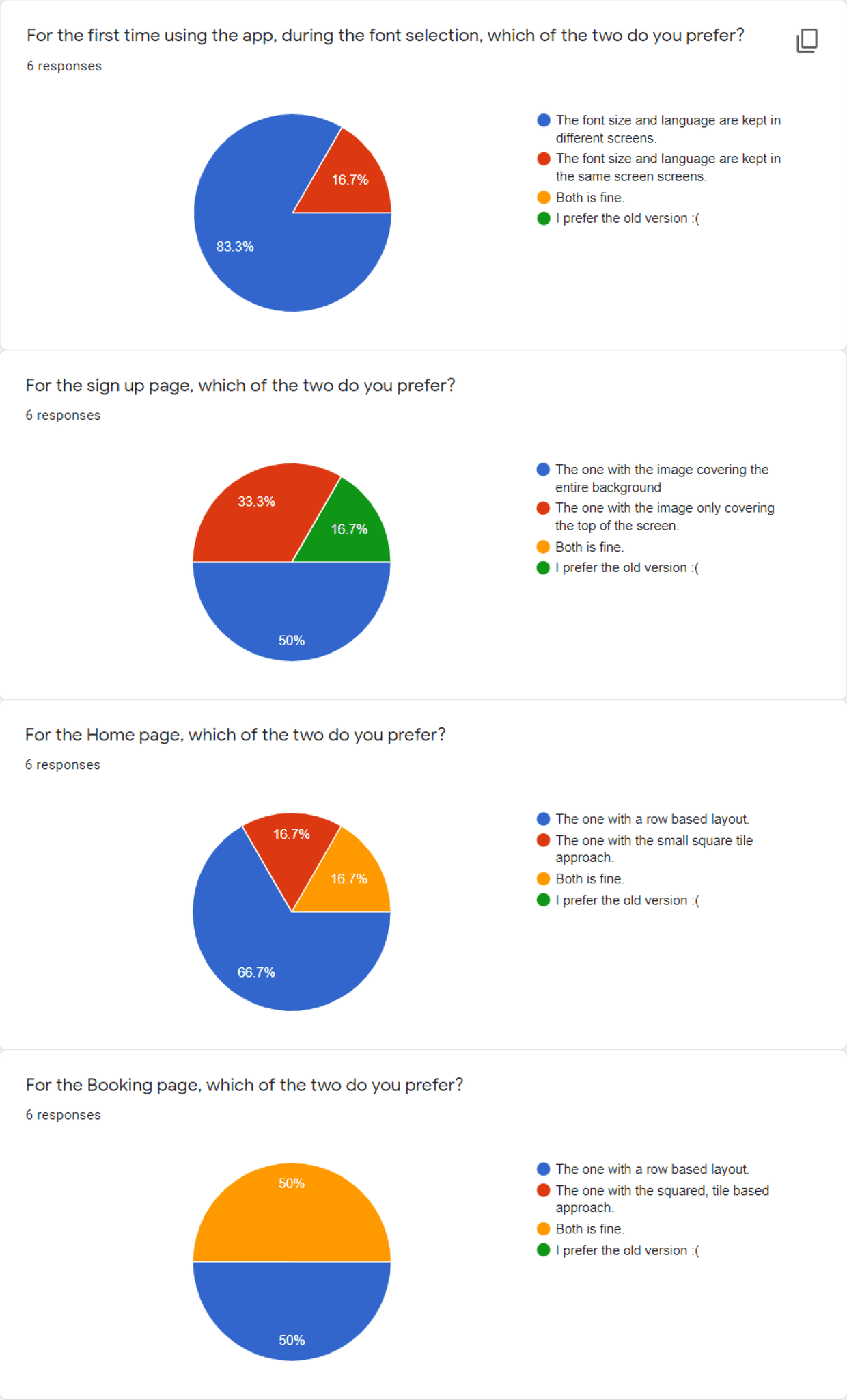
We tested with real users to validate our designs and prototypes. Users were tasked to navigate the app, after which they were to fill up a survey to describe their experiences and pain points. A method we used to validate our design was AB testing which made the design selection process easier.
Final Design
Project Restropective
Here are the key takeaways that we have learned from this project:
Importance of User Research & Testing
Understanding the crucial role of user testing and research in product development is vital to creating a successful product. Gathering insight into user pain points and addressing them effectively helps align the product design with user needs, avoiding the consequences of ignoring user preferences and requirements. Thus, it is imperative to gather insight into user pain points and address them effectively.Proper Task Delegation
Effective delegation and a clear definition of team roles is an important aspect of the project that has helped the team complete the project smoothly and efficiently. By working together, the team has earned a sense of pride in their accomplishments and improved their efficiency and productivity.Power of Strong Branding
The significance of branding in building a successful company cannot be overstated. Research shows that a strong brand can command a premium price compared to a weak brand. By developing a well-designed and effective brand, CDC will be able to solidify its position as a leader in the industry and attract more customers in the long run.
© Min Ern Koh 2025
