Introduction
Letterboxd is a beloved social networking service for film enthusiasts, and allows users to interact with each other through their shared interests in films.
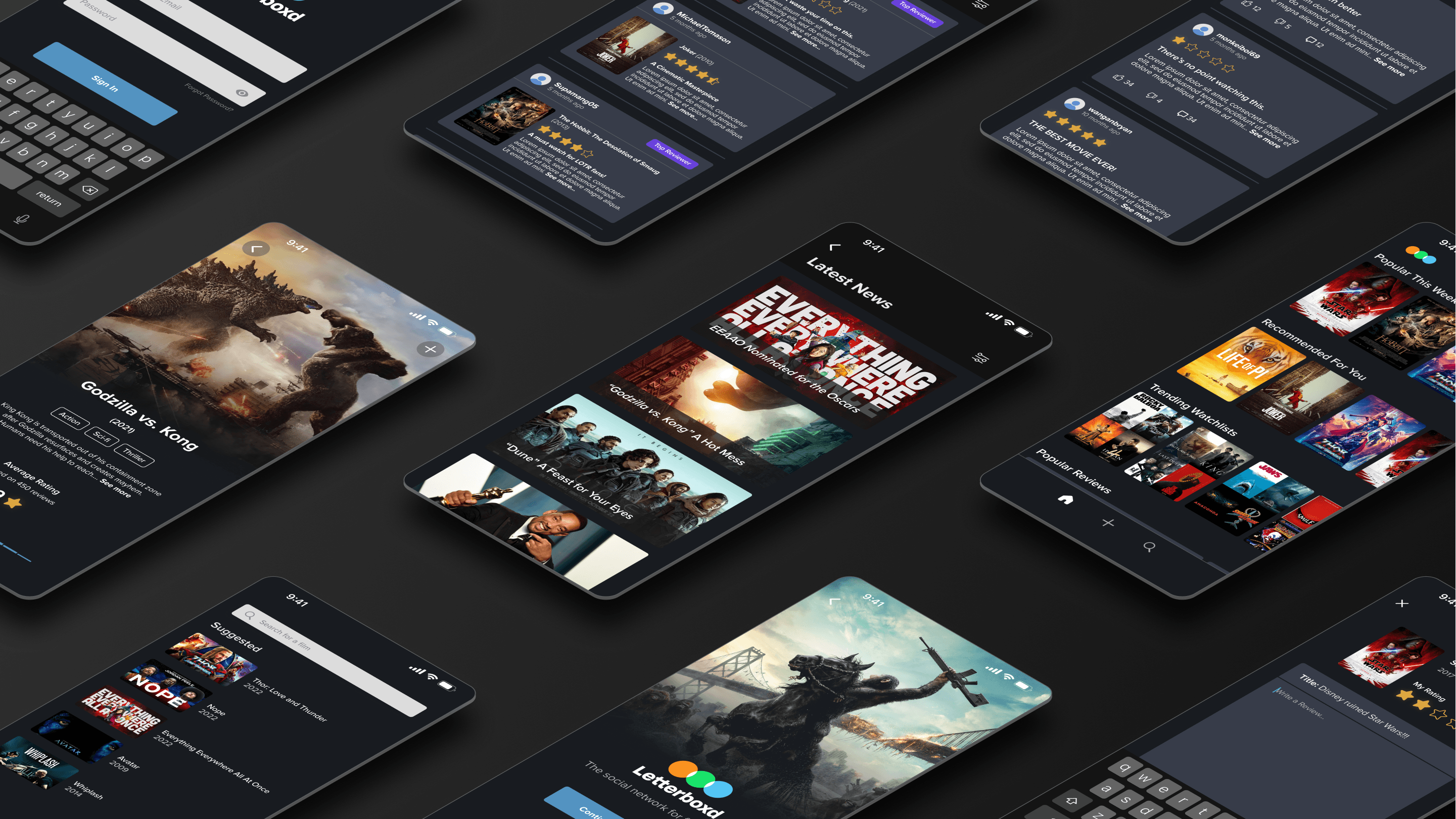
In this case study, my team and I embarked on a mission to overhaul the app, focusing on user interaction and visual design to create a more streamlined and enjoyable experience. This project was completed in six weeks.
My Role
I was the Lead UI/UX Designer of the team. My main role was to create the high-fidelity prototype and user personas using the test results we obtained. Additionally, I assisted in user research and usability testing.
Problem Statement
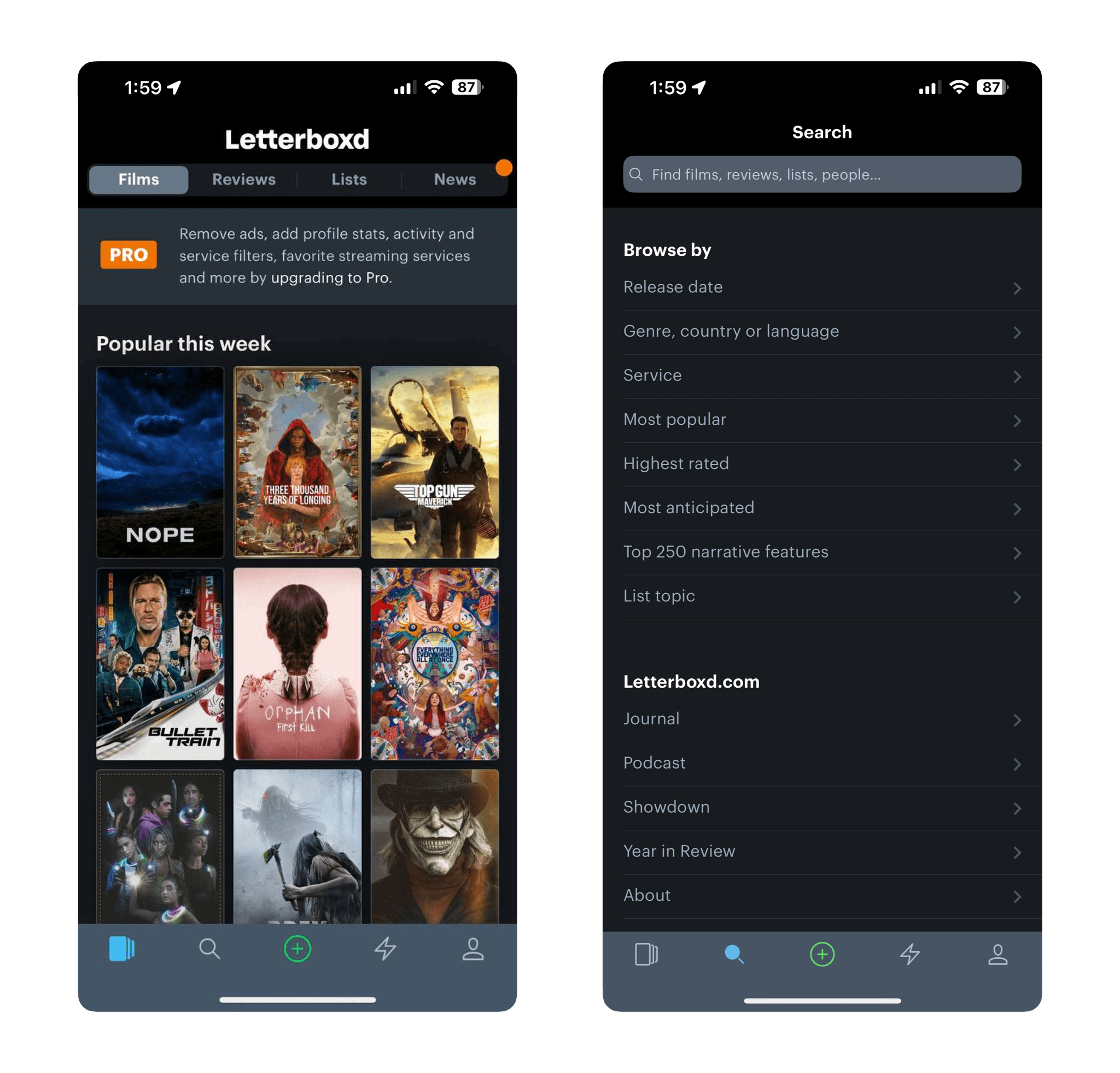
Letterboxd is an app with a plethora of features. However, a lack of focus leads to the app being deemed cluttered and unintuitive. Leading to a subpar experience for end users.
These were the main problems that we have found in the existing app:
The process to reach the end goal requires too many steps and navigating through the UI; resulting in numerous pain points for users.
UI could be more intuitive; poor use of screen space let to screens being deemed as cluttered.
Unnecessary steps; pages were stacked on top of each other which required a lot of swiping resulting in a constant back and forth between pages.
Goal
The goals of the project were to:
Resolve pain points for users
Streamline the User Flow process
Enhance the application’s core feature; writing movie reviews
Design Process
Following an Agile-inspired approach, we engaged in constant collaboration and iterative testing with our target audience.
User Personas
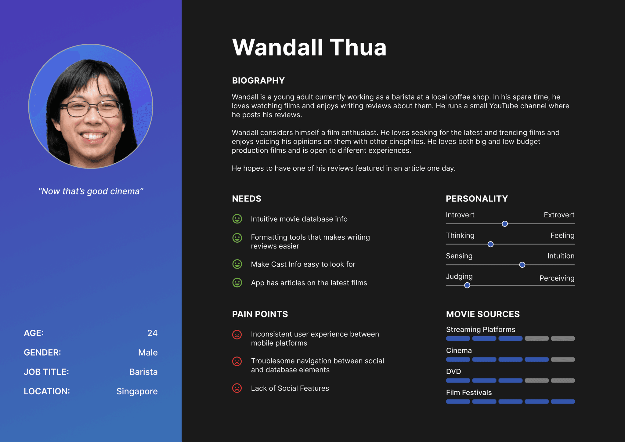
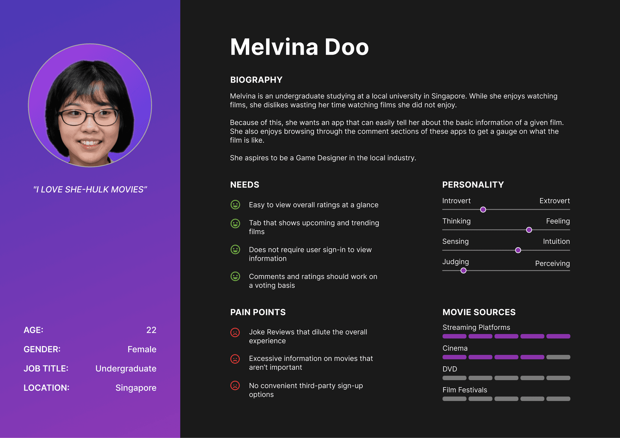
We started by creating two user personas. One of which is a film enthusiast, and the other a casual viewer. We thought that having by having two user personas of contrasting personalities, it would give us a better insight into creating an app that is suitable for everyone.
The Creator Archetype
The first persona is a 24-year-old man who is a passionate film enthusiast. Besides watching films, he enjoys sharing his opinions with others by writing reviews. However, he has been feeling frustrated with the Letterboxd app, as he finds the UI to be clunky and inconsistent across different operating systems. Despite his love for the app's concept, he believes that there is a lot of improvement to be made to enhance the user experience.
The Explorer Archetype
The second persona is a 22-year-old lady who is currently pursuing an undergraduate degree. She enjoys watching movies as a casual filmgoer and likes to stay up-to-date with the latest trends. However, she has found that the Letterboxd app contains an overwhelming amount of unnecessary information that can make it difficult to navigate. She wishes that the app could be more streamlined and user-friendly so that she can easily find the content that she is interested in.
User Journey Map
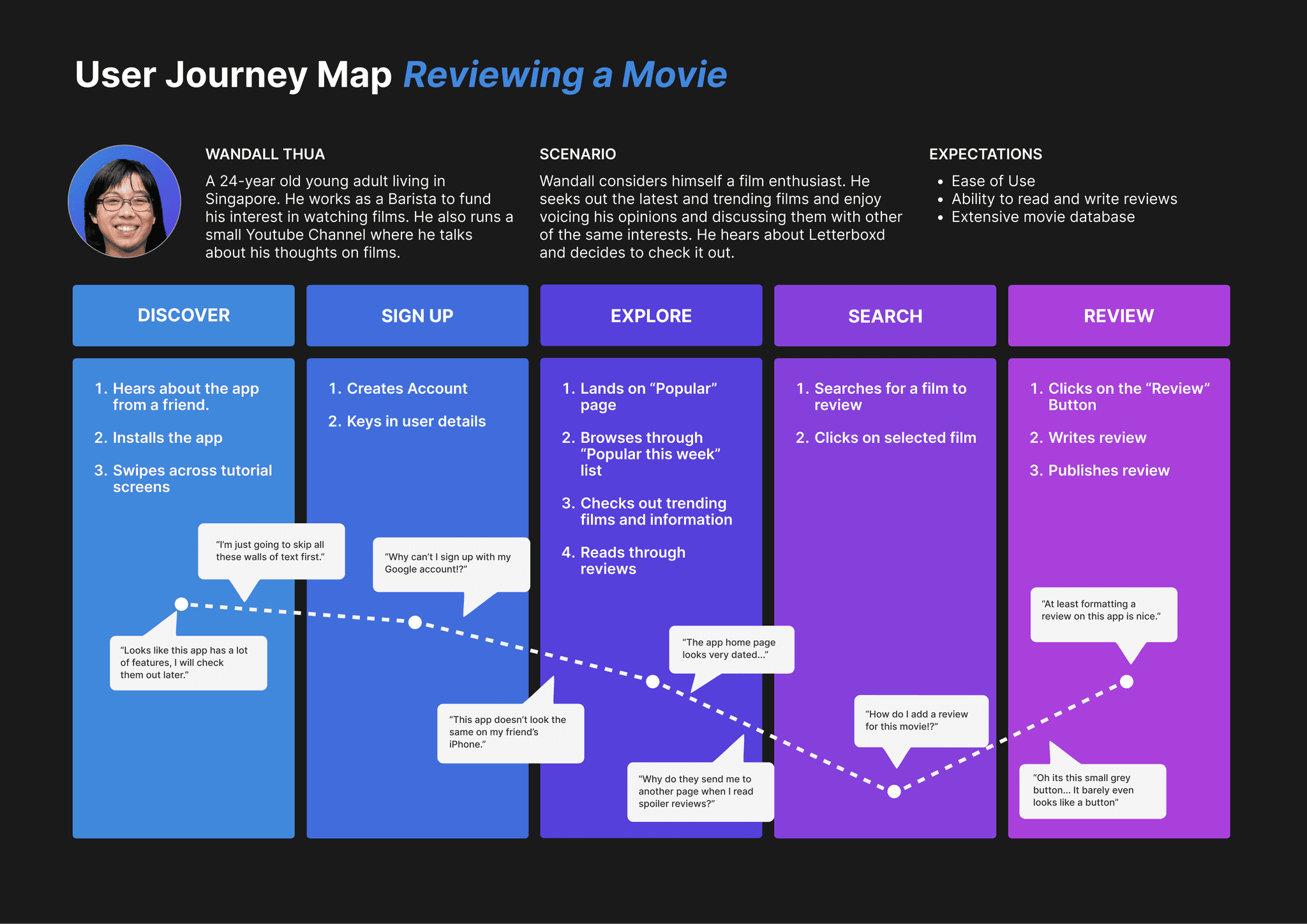
In this User Journey Map, it shows that our primary persona, Wandall, had a rather neutral experience with the app. He experienced frustration with the UI and onboarding process as he took a considerable amount of time to navigate through the app. He also feels that there is a lot of room for improvement in terms of consistency.
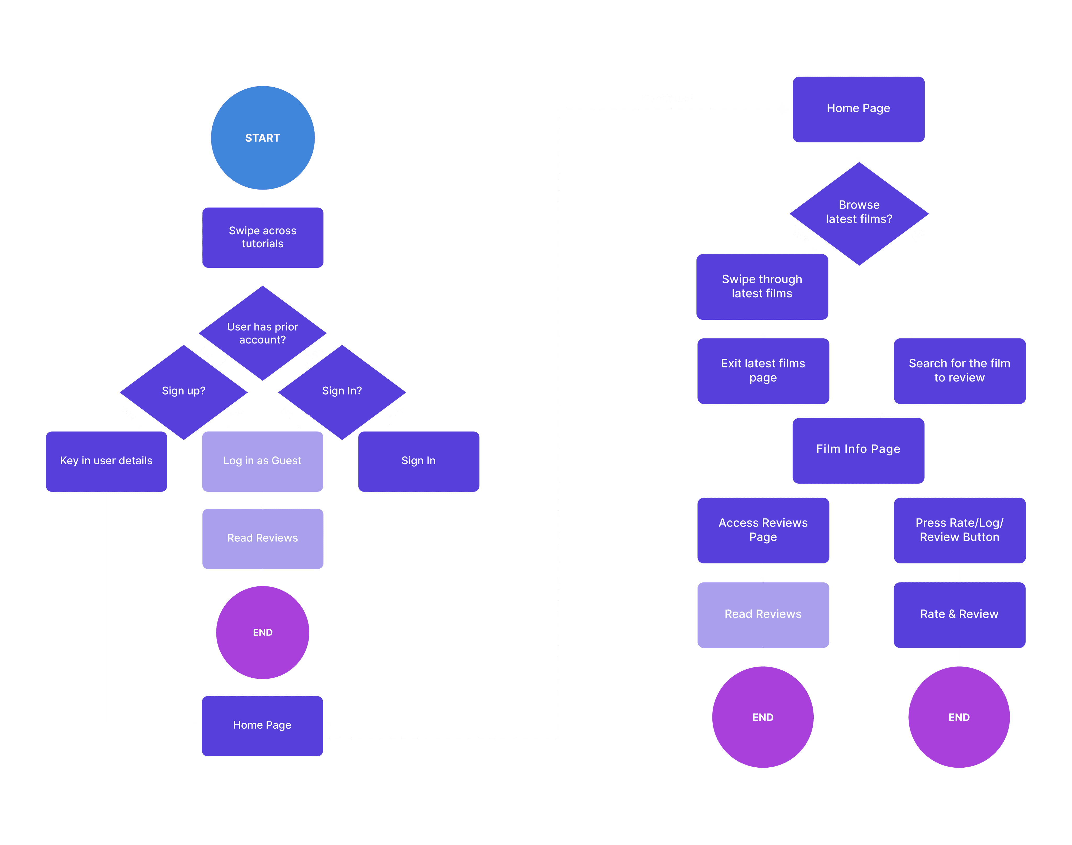
User Flow
Prototyping
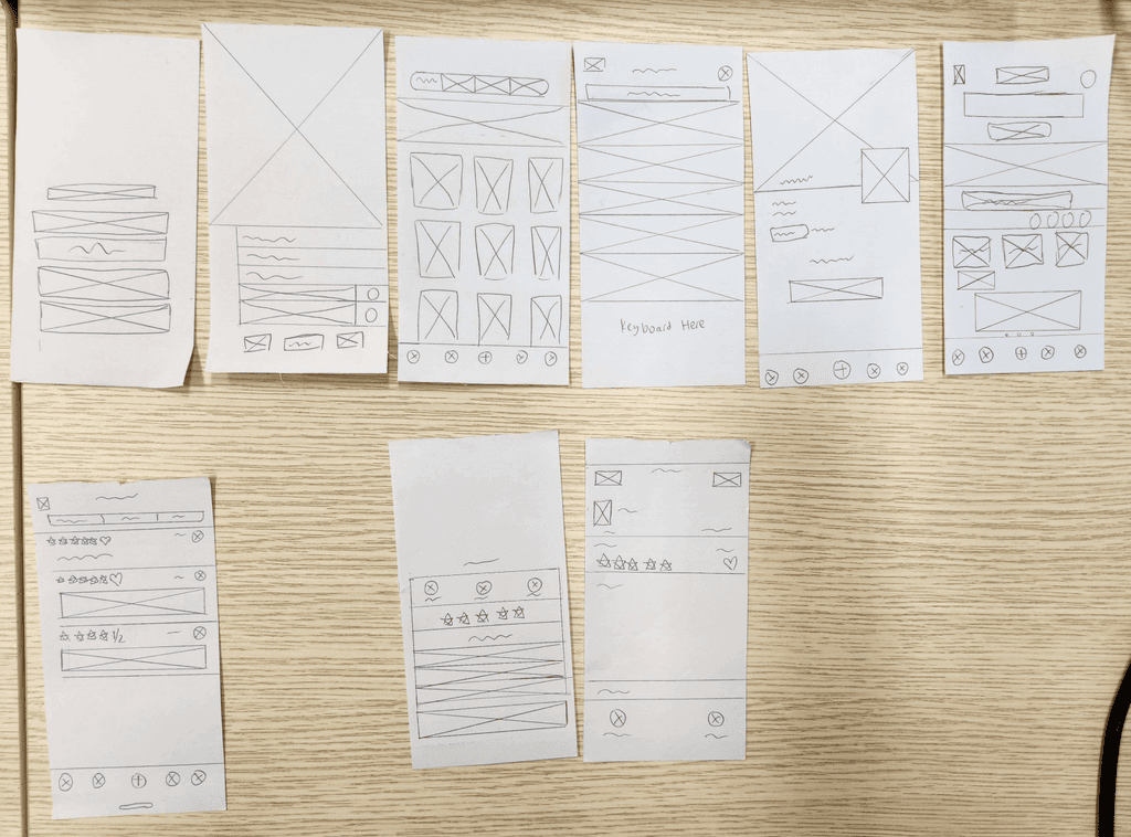
Low-Fidelity Prototype
We utilized paper prototyping for initial user navigation insights.
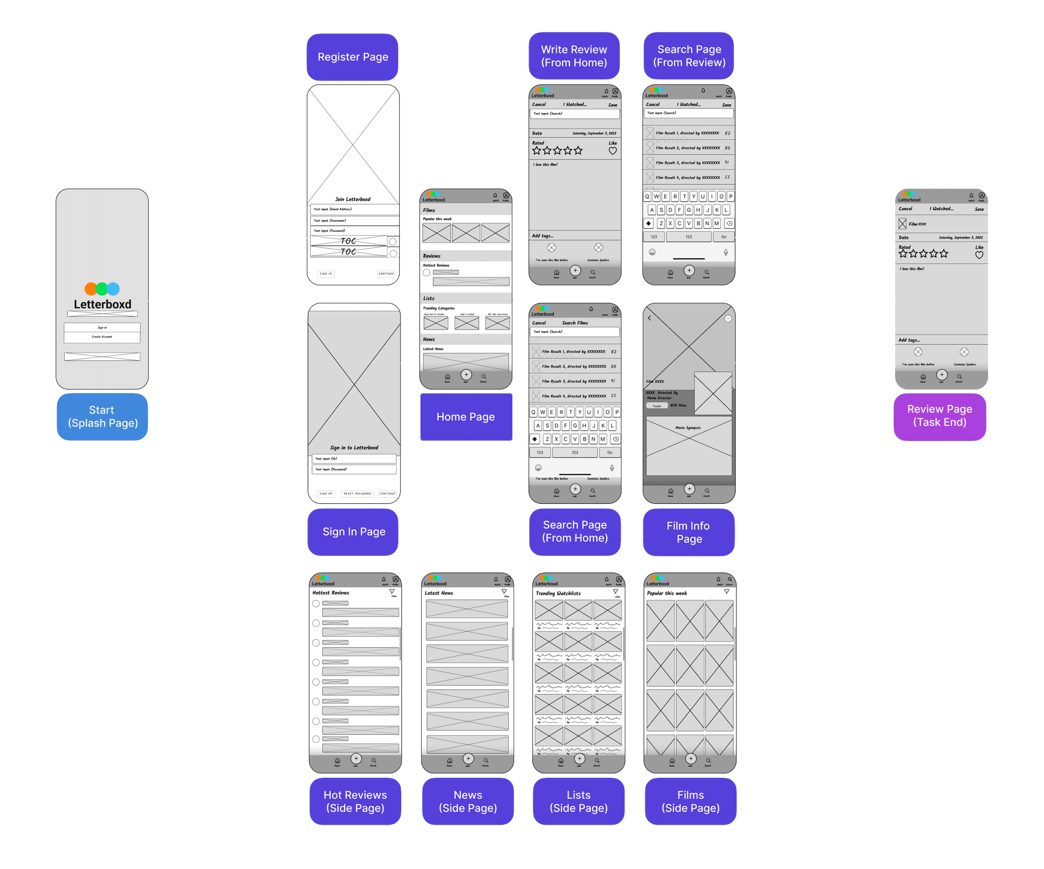
Medium-Fidelity Prototype
We then moved on to making the medium-fidelity prototype in Figma, this time adding more features that are in the core app.
Usability Testing
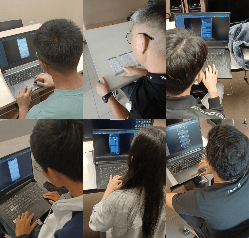
We did guerrilla testing with real users to validate our designs and prototypes. Users were tasked to navigate the app, after which they were to fill up a survey to describe their experiences and pain points.
Here were the key pain points based on our findings:
Unclear Feature Hierarchy
The findings revealed that the absence of a clear feature hierarchy disrupted the straightforwardness of the core user task flow, making it challenging for users to complete tasks.Complicated Task Flow
Certain actions were found to have a complicated user task flow, causing frustration and confusion for users.Overcrowded Pages
Overcrowding of information and UI on some pages led to visual exhaustion for users and made it difficult for them to complete tasks.Confusion with Interactive Elements
Users reported confusion about which elements on the screen were interactive, leading to incorrect actions and disruptions in their task flow.Interruptions in Core Flow
Users experienced interruptions in the core app flow, causing frustration and hindering their ability to complete tasks effectively.
Final Design
Project Restropective
© Min Ern Koh 2025
